
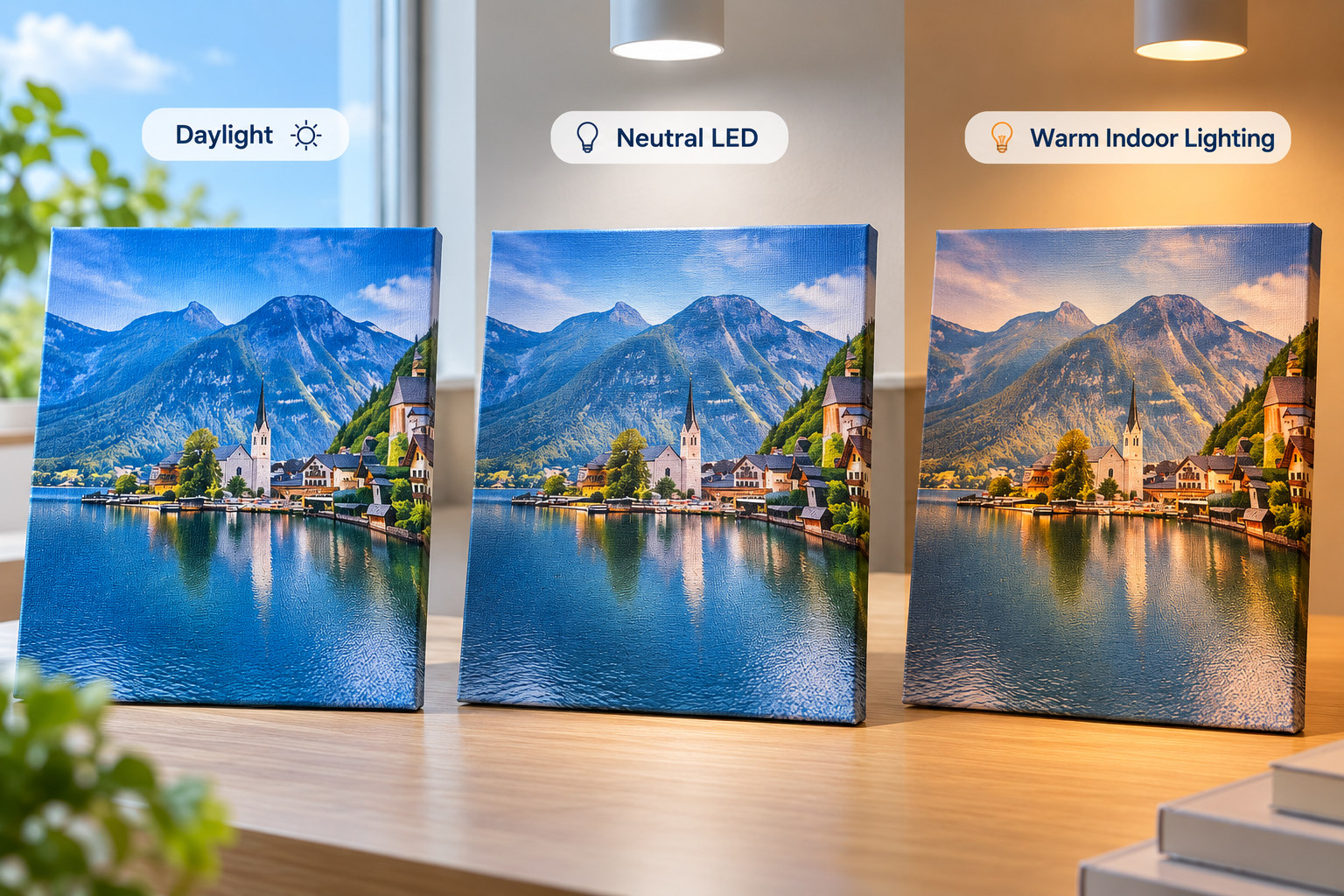
A printed canvas can appear different under daylight, neutral LED light, warm indoor light or directional spot lighting even when the physical print has not changed. The light source, its spectral characteristics, the viewing environment, surface gloss, viewing angle and canvas texture all affect the light that reaches the viewer. A visible change under another light source therefore does not automatically mean the printable canvas is defective.
Evaluation should first separate three possibilities: a normal change in visual appearance caused by lighting, a color-management or printing issue, and a physical inconsistency in the printed surface. The way the change behaves across the sample and under controlled viewing conditions provides more useful evidence than judging it in one room.
Why Can the Same Canvas Print Look Different Under Different Lighting?
The viewer does not see the digital file directly. Light falls on the printed canvas, interacts with the ink, printable coating and woven surface, and is then reflected toward the eye. The resulting appearance depends on both the print and the viewing condition.
Daylight, LEDs and warm indoor lamps have different spectral power distributions. Two lamps can also have a similar stated color temperature while producing different visual results because color temperature alone does not describe the complete spectrum of a light source. Surrounding wall colors, illumination level and nearby bright or dark objects can further influence visual judgment.
Viewing angle matters as well. Moving a glossy canvas, changing the angle of a spotlight or standing in another position can change the amount of directional reflection reaching the eye. On a textured canvas, the same movement can also change the balance of highlights and shadows across the weave.
What Is Metamerism in Printed Images?
Metamerism has a specific meaning. A metameric match occurs when two spectrally different color samples appear to match under one specified illuminant and observer condition but no longer match when the illuminant changes. In production, this can become visible when a print is compared with a proof, approved reference or another printed component made with different colorants or materials.
Not every lighting-related color change is metamerism. If one canvas print looks generally warmer under a warm lamp and cooler under daylight, that is a change in color appearance caused by illumination. Metamerism concerns the relationship between two colors or samples that match under one condition and separate under another.
When investigating a suspected metameric mismatch, compare the same two samples under defined light sources, keep their positions and viewing angles consistent, and avoid mixing conclusions about color with reflections from a glossy surface.
Daylight vs LED vs Warm Indoor Lighting
| Lighting Condition | What May Change Visually | What to Watch |
|---|---|---|
| Daylight | Color balance and brightness can change with time of day, weather, season and the direction of the window light. | Do not treat uncontrolled window light as a fixed reference. Record the condition when it is used for approval. |
| Neutral or cool LED | Neutrals, skin tones and saturated colors may appear different from daylight or warm lighting. Results can vary between LED products with similar color temperatures. | Check neutral balance and reference colors under the actual LED type used in the intended environment. |
| Warm LED or incandescent-like lighting | The print may take on a warmer appearance, while cool colors and some neutral relationships can look less prominent. | Review skin tones, grays, blues, shadows and overall image balance. |
| Directional gallery or retail spotlights | Gloss, glare, highlights and shadows across the canvas texture can become more visible. | Inspect from the expected viewing positions and check whether reflections hide important image detail. |
No single light source represents every final installation. A defined condition is useful for repeatable approval, while representative end-use lighting shows how the product will be experienced in practice.
How Do Glossy and Matt Printable Canvas React to Lighting?
Glossy and matt surfaces distribute reflected light differently. A glossy surface produces a stronger specular component, which concentrates reflection around a particular angle. This can create visible glare or a reflected image of a window or lamp. When either the light or viewer moves, the reflection can move across the printed image.
A matt surface distributes more reflected light across different directions, reducing obvious mirror-like glare. It does not eliminate reflection completely, especially at shallow viewing angles or under strong directional lighting. Matt and glossy finishes are different visual choices rather than quality rankings.
The effect should be assessed on a printed sample because ink coverage and the printable surface work together. For a broader finish comparison, see Gowin’s matte vs glossy printable canvas guide.
Can Canvas Texture Change How a Print Looks Under Light?
Yes. The woven structure creates small changes in surface angle across the canvas. Under broad, diffuse illumination, these changes may appear subtle. Under a directional light, raised threads can catch highlights while lower areas remain in shadow, making the texture look stronger.
The printable coating, surface finish and ink coverage also influence reflection. A smooth glossy surface and a pronounced matt weave will not respond to the same lighting in the same way. This affects visual appearance, but it does not mean the digital color values or measured print values have physically changed whenever the viewing light moves.
When comparing two canvases, use the same image, light direction, viewing distance and angle. Otherwise, a texture or reflection difference may be mistaken for a color-density difference.
Why Can Dark Areas and Blacks Look Different Under Different Lighting?
Black appearance depends on more than ink density. Ambient illumination, surrounding contrast, surface gloss and viewing angle all affect how much reflected light reaches the eye. A dark area on glossy canvas may look deep from one position but lighter or more reflective when a lamp enters the specular reflection angle.
Matt surfaces usually show less concentrated glare, but strong illumination can still make dark areas appear lighter than they do in a dimmer room. Nearby bright walls or displays can also change perceived contrast. When black performance is important, compare the same dark test area from a consistent angle and separate reflected highlights from the printed black itself.
Does a Lighting Difference Mean the Canvas or Coating Is Defective?
Not necessarily. A change is more likely to be a normal viewing-condition effect when it responds predictably to the light source or viewing angle and the complete printed area behaves consistently. A glossy reflection that moves when the viewer moves is different from a fixed patch of uneven gloss.
Further investigation is reasonable when:
- one localized area behaves differently from the surrounding printed surface;
- gloss is visibly inconsistent across the same image area;
- density variation remains visible under a controlled, uniform viewing condition;
- different areas, rolls or batches show inconsistent surface behavior under matched printing and viewing conditions; or
- the production result differs materially from the approved sample when both are compared under the same conditions.
These observations justify controlled comparison; they do not prove coating failure by themselves. Printing settings, ink load, drying or curing, handling and the evaluation environment should also be checked.
How Should B2B Buyers Evaluate Printable Canvas Under Lighting?
- Define a primary viewing condition. Use a stable, documented condition for approval and repeat comparisons under that condition.
- Inspect the intended application lighting. Also view the sample under representative retail, residential, gallery, hospitality or exhibition lighting where relevant.
- Keep the viewing geometry consistent. Compare samples at the same angle, distance and orientation.
- Place samples side by side. Do not rely on visual memory when comparing finishes, batches or references.
- Use the same test file. Include neutral gray, skin tones, saturated colors, gradients and dark areas where relevant to the product.
- Check more than color. Review glare, gloss uniformity, surface texture and whether reflections hide image detail.
- Record the approval condition. Note the light source, room, approximate viewing angle and any other condition needed to repeat the comparison.
- Keep the approved sample. Store it as a physical reference for repeat production and supplier communication.
These checks can be included in the wider printable canvas sample approval process. If printer and ink compatibility still need to be confirmed, first review how to choose printable canvas for different printing systems.
Should You Approve a Printable Canvas Under Only One Light Source?
For critical print evaluation, standardized viewing conditions are commonly used to make visual comparisons more repeatable. D50 is widely used as a reference illuminant in graphic-arts workflows, but it should not be confused with every form of natural daylight.
A defined viewing condition improves repeatability, but it does not mean a print will look identical under every LED, warm lamp or spotlight. D50 provides a reference for controlled comparison.
If the finished canvas will be displayed under a known end-use light, inspect it there as well. A controlled reference answers whether production matches the approved standard; representative application lighting answers whether the finished print creates the intended visual result.
Lighting Checklist for Printable Canvas Sample Approval
| Check | What to Observe | Why It Matters |
|---|---|---|
| Color appearance | Overall hue, saturation and image balance | Shows how the complete image responds to the viewing light |
| Neutral balance | Gray areas and near-neutral tones | Makes lighting-related color casts easier to notice |
| Dark areas | Black appearance, shadow detail and reflected highlights | Separates printed density from surface reflection |
| Gloss and glare | Reflections that move or hide image detail | Shows whether the finish suits the installation and viewing angles |
| Surface uniformity | Fixed patches or uneven sheen across comparable areas | Helps distinguish a localized inconsistency from normal glare |
| Texture | Highlights and shadows across the weave | Shows how directional light changes perceived surface character |
| Viewing angle | Changes as the sample or viewer moves | Identifies angle-dependent reflection rather than a fixed print defect |
| Approved reference | Difference between the production sample and retained standard | Provides a repeatable basis for production and supplier review |
Frequently Asked Questions
Why does my canvas print look darker indoors?
Indoor illumination may be lower than daylight and may have a different spectral distribution. Surface reflection and surrounding contrast also affect perceived darkness. Compare the print under a controlled reference light before deciding that its printed density has changed.
Why does glossy printable canvas change appearance when I move?
Glossy surfaces produce stronger directional reflection. Moving the viewer, canvas or light changes the reflection angle, so glare and perceived black depth can change even though the printed image remains the same.
Is every lighting-related color shift metamerism?
No. Metamerism describes a match between spectrally different samples that holds under one specified viewing condition and breaks under another. A single print looking warmer or cooler under different lighting is not, by itself, proof of metamerism.
Should printable canvas be evaluated under daylight?
Daylight can be useful, but uncontrolled daylight changes with time, weather and location. Use a defined viewing condition for repeatable approval, then inspect the canvas under representative end-use lighting where practical.
Request a Printable Canvas Sample from Gowin
When requesting a sample, provide the printer model, ink system, preferred finish, required width, intended application, estimated quantity and destination. Test the sample with the intended printing setup and review it under both the controlled approval condition and the expected end-use lighting.
Gowin’s printable canvas roll range includes options for different printing systems, materials and finishes.